
Articles

Autumn Interior Refresh in Australia: Feature Wall Colour, Warm Neutrals, and a Practical Painting Plan for Living Spaces

20/03/2026
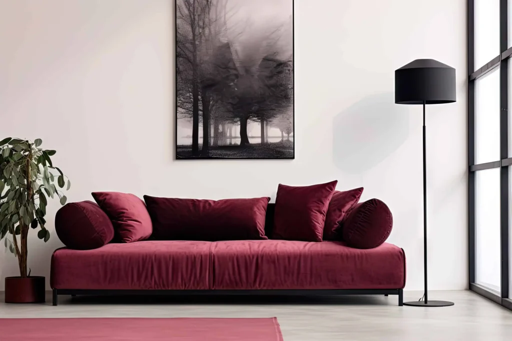
Autumn is the season when many Australian homes start to feel the shift: the light softens, evenings cool down, and indoor spaces become more central to day-to-day comfort. That seasonal change is also a high-impact time to refresh interiors. You can make a room feel warmer and more inviting without major renovations, simply by adjusting colour, finish, and the way light moves through the space.
 
This article is an autumn interior refresh plan designed to be practical. It focuses on a feature wall and coordinated neutrals, because that is the most reliable way to get a visible change without committing to a full-home repaint. You will learn:
 
  • How to choose feature wall placement that actually improves a room
  • How to select autumn-friendly neutrals and accent colours that hold up in real lighting
  • How to test undertones properly, especially with whites and warm greiges
  • How to plan a clean, professional paint finish with less rework
  • How to use Wattyl I.D Advanced as the hero system for high-use living spaces
If you want more room-by-room inspiration after reading, start here: https://www.wattyl.com.au/category/inspirations/

1) The autumn refresh strategy: make the room feel warmer without making it darker

A common mistake in autumn colour updates is going too deep and reducing the room’s perceived brightness. The stronger approach is to create warmth through undertone and contrast, not simply by choosing darker paint.

A reliable autumn structure
  • Broadwall neutral that works in both daylight and warm evening lighting
  • Feature wall colour that adds depth and mood
  • Trim colour that keeps edges crisp and supports light bounce
  • Soft furnishings and materials that echo the undertones, so the paint looks intentional
Need general help with selecting interior paint colours before choosing specific shades? Check out https://www.wattyl.com.au/articles/what-to-consider-when-selecting-your-interior-paint-colours/

2) Choosing the right feature wall: placement matters more than colour

If you choose the wrong wall, even the perfect colour looks odd. Your feature wall should support the room’s layout, not fight it.

2.1 The best feature wall candidates in living rooms
A feature wall works best when it sits behind a “primary anchor” such as:

  • The sofa wall
  • The TV or media wall
  • A fireplace wall
  • The wall behind a built-in shelf or joinery
  • A wall that frames a major artwork or mirror
If the room already has a clear focal point, the feature wall should reinforce it.

For feature wall inspiration and common layouts, use:

2.2 Feature walls that usually under-perform
Avoid making these walls the feature unless there is a strong reason:
 
  • Short, disconnected walls that do not relate to furniture placement
  • Walls broken by too many doors and openings
  • Narrow corridors, unless you are deliberately creating a gallery look
  • Walls that receive harsh, uneven lighting that exaggerates texture

3) Colour selection: warm neutrals, grounded accents, and confidence in undertones

Autumn palettes feel natural because they mirror what happens outdoors: softer light, warmer shadows, and deeper contrast.

3.1 Start with a curated palette, not infinite choice
If you get overwhelmed by colour selection, starting here:


For broader browsing and a good internal navigation loop, use the Wattyl Paint Colour Chart.

3.2 Autumn-friendly colour directions that work across most home styles
These are dependable directions that suit Australian lighting:

Warm greiges and creamy neutrals (broadwall)

  • Creates warmth without reading “yellow” when done correctly
  • Works with timber floors, stone, black accents, brushed brass and warm whites

Soft greens (feature wall)


Deep, muted blues or charcoal tones (feature wall)

4) Whites and trims: the detail that makes an autumn refresh look expensive

Even when your feature wall is the star, trims create the finished look. The wrong white can make everything feel off.

4.1 Use a deliberate trim plan
Trims include:
 
  • Skirting boards
  • Architraves
  • Door leaves and frames
  • Window trim
  • Built-in cabinetry edges (sometimes)
If you keep trim consistent, your feature wall reads more cohesive.

4.2 White undertones must be tested in your real lighting
Indoor lighting temperature, floor colour, and nearby materials shift undertone. A white that looks “clean” on a sample card can read cool or creamy on a full wall.

Check out:


4.3 Testing method that reduces repaint risk
Recommended testing process:

  • Choose 3 to 5 candidate colours
  • Paint large swatches, not small patches
  • Check at four points: morning, midday, late afternoon, and under your night lighting
  • Check next to fixed elements you cannot change: flooring, rug, sofa, joinery, benchtops
This process is slow, but it saves money compared to rework.

5) Product selection for living areas: why I.D Advanced fits high-use rooms

Living rooms, hallways and open-plan areas have two realities:
 
  • They get touched and cleaned more often than people expect
  • Lighting is often mixed, so finish consistency matters
Wattyl I.D Advanced is a high performance interior range designed around durability and protection features for both domestic and commercial settings.
 
For more information, see:
 
If the refresh extends into wet or high-humidity zones like a powder room near the living area, keep it within the same family:


6) Finish selection: matt vs low sheen in living spaces

Finish choice is not only aesthetic. It affects how the wall looks under angled light and how it handles cleaning.

6.1 Matt finish: when it works best
  • Helps soften surface imperfections
  • Works well in bedrooms, lower-traffic lounge rooms, and feature walls
  • Can look more “design-led” in spaces with soft lighting

6.2 Low sheen finish: the practical default for most homes
  • Often chosen for broad walls in living areas and hallways
  • Balances appearance with easier ongoing maintenance
  • Holds up well in open-plan spaces where scuffs happen

A good rule for homeowners is:

  • Feature wall: matt if the surface is imperfect and you want a softer look
  • High-traffic walls: low sheen for practical cleanability

7) The professional-looking feature wall method (clean lines, consistent texture)

A feature wall looks simple when it is finished. The difference is nearly always prep and application sequence.

7.1 Prep checklist (do not skip)
  • Clean the wall so paint bonds properly
  • Patch dents and nail holes, then sand smooth
  • Remove dust fully
  • Protect edges with painter’s tape where needed
  • Prime patches if required so sheen and colour absorb evenly
For more help, see How to paint an interior wall.

7.2 Clean cut lines around trims and corners
For a sharp feature wall edge:

  • Use tape only on clean, dust-free surfaces
  • Press edges down firmly
  • Cut in carefully first
  • Remove tape at the correct time so you do not tear the film
Need help with painting a feature wall? See:
 

7.3 Paint sequence that reduces lap marks
  • Cut in first
  • Roll while cut-in edges are still workable
  • Paint in vertical sections
  • Maintain a wet edge
  • Apply two coats for uniform depth and coverage
Wattyl’s interior wall guide includes practical rolling and lay-off technique: https://www.wattyl.com.au/how-to/how-to-paint-an-interior-wall/

8) Styling ideas: autumn cues that make the paint choice feel intentional

This is where an Inspirations article should go beyond “paint a wall” and link paint to the rest of the room, without making unprovable claims.

8.1 The “warm neutral plus texture” formula
If the broad walls are neutral:

  • Add warmth through timber, rattan, leather, boucle, linen
  • Use layered lighting: floor lamp plus warm downlights
  • Echo the paint undertone in cushions and rugs
8.2 The “green feature wall” formula
Green works well when paired with:
 
  • Warm whites for trims
  • Timber floors and joinery
  • Black accents in frames or lighting
  • Natural textiles

9) Room-by-room applications: where this Autumn plan works best

9.1 Living room
  • Feature wall behind the sofa or TV
  • Broad walls in a warm neutral
  • Low sheen for scuff-prone walls
See:
 
9.2 Hallway and entry
This is where paint gets the most wear from hands, bags, and daily movement.

  • Choose a finish that suits regular wipe-down
  • Keep colour lighter to maintain brightness
9.3 Bedrooms
Bedrooms often benefit from:

  • A softer matt feature wall behind the bed
  • Warm neutrals that work under lamp lighting
  • A consistent white trim to keep the space crisp
Tools for selecting whites:
 

10) Project checklist (copy and paste)

Planning
Testing
 
  • Paint large swatches on the actual wall
  • Check in daylight and under night lighting
  • Confirm undertones next to flooring and furniture
Prep
 
  • Clean walls
  • Patch and sand
  • Remove dust fully
  • Mask edges for clean lines
Painting
 
Finish selection
 

FAQ

1) What is the best feature wall location in a living room?
 
Usually the wall behind the sofa, the TV wall, or a fireplace wall. The feature wall should reinforce the room’s focal point. Inspiration and layouts here:


2) How do I avoid a feature wall looking random?


Match placement to furniture layout and repeat the feature colour undertone in soft furnishings, artwork, or decor. Use a structured palette reference:


3) Should I choose matt or low sheen for a feature wall?


Matt can soften imperfections and look more velvety, while low sheen is often more practical for scuff-prone walls. Product options include Wattyl I.D. Advanced Matt and Wattyl I.D. Advanced Low Sheen.
 
4) How do I choose a warm neutral that does not turn yellow at night?
 
Test large swatches and check them under your real evening lighting. Use undertone guidance here:
 
5) Why do whites look different once painted?
 
Undertone shifts with lighting, flooring, and nearby materials. Start with Wattyl’s whites and follow the testing method:
6) How many coats do I need for a feature wall?
 
Two coats is the common standard for colour depth and uniformity, particularly for stronger feature colours. Follow the method here:
 
7) What is the most common DIY mistake on feature walls?
 
Poor prep and uneven edges. Patch properly, sand smooth, remove dust, and use a clean cut-in and rolling sequence: https://www.wattyl.com.au/articles/your-diy-guide-to-painting-a-feature-wall/


8) Can I use the same paint system in living rooms and wet areas?
 
Wet areas need products formulated for humidity and frequent cleaning. Within the I.D Advanced family, use the Kitchen and Bathroom options in those zones:
 
9) Where can I find more Wattyl inspiration for colour and styling?


10) Where can I find more Wattyl how-to guidance?


Articles you may also like

News 30/04/2026
How to Paint a Bathroom Ceiling to Prevent Mould

Bathroom ceiling mould is one of the most frustrating problems ...

right arrow
News 13/03/2026
Shona McElroy - Mirrorball

A fairly dark, space-challenged penthouse in a 1920s Spanish Mission ...

right arrow

We are here for you, ask us anything

Leave your enquiry and details below, and we’ll get back to you as soon as possible.